PROJECTS
Pastel skin
Everyone who knows me a little bit better, probably knows that I love skincare products, especially the organic and minimalistic ones. That's the reason why I decided to develop my own imaginary Brand "Pastel Skin".
I did the project completely on my own, from brand identity to 3D renders as well as some of the pictures are ai generated. For this project, I wanted to play with different technologies and combine them to one one concept.
Client
noncommercial
Industry
Skincare
Year
2023
Role
Brand Design & 3D
Concept
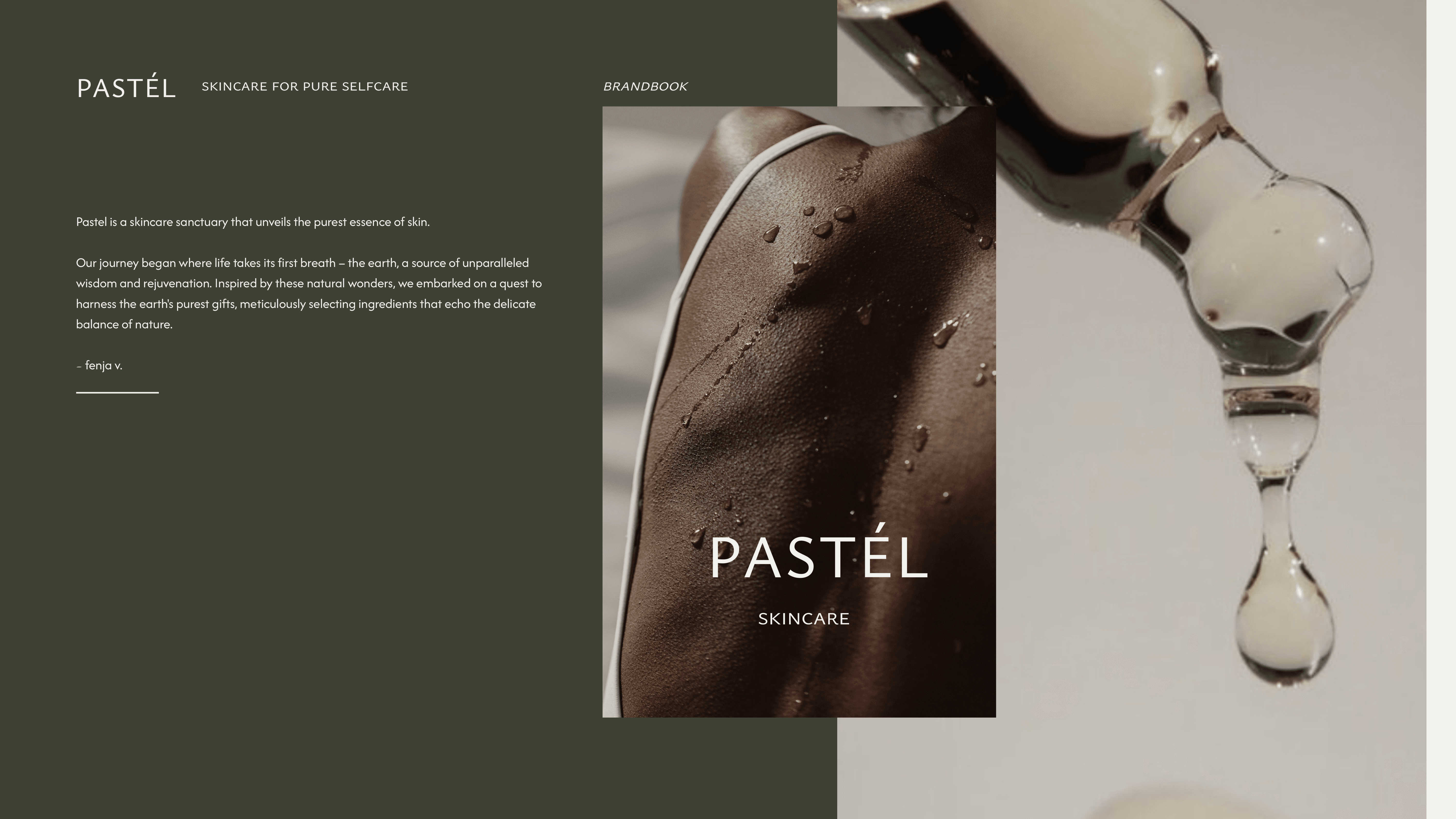
The name "Pastel skin" is derived from the softness that pastel colours convey in the environment and still trigger
a warm feeling. This is exactly what the skincare products are supposed to do.
The Brand feel Pure, Rough, Organic and Calm.
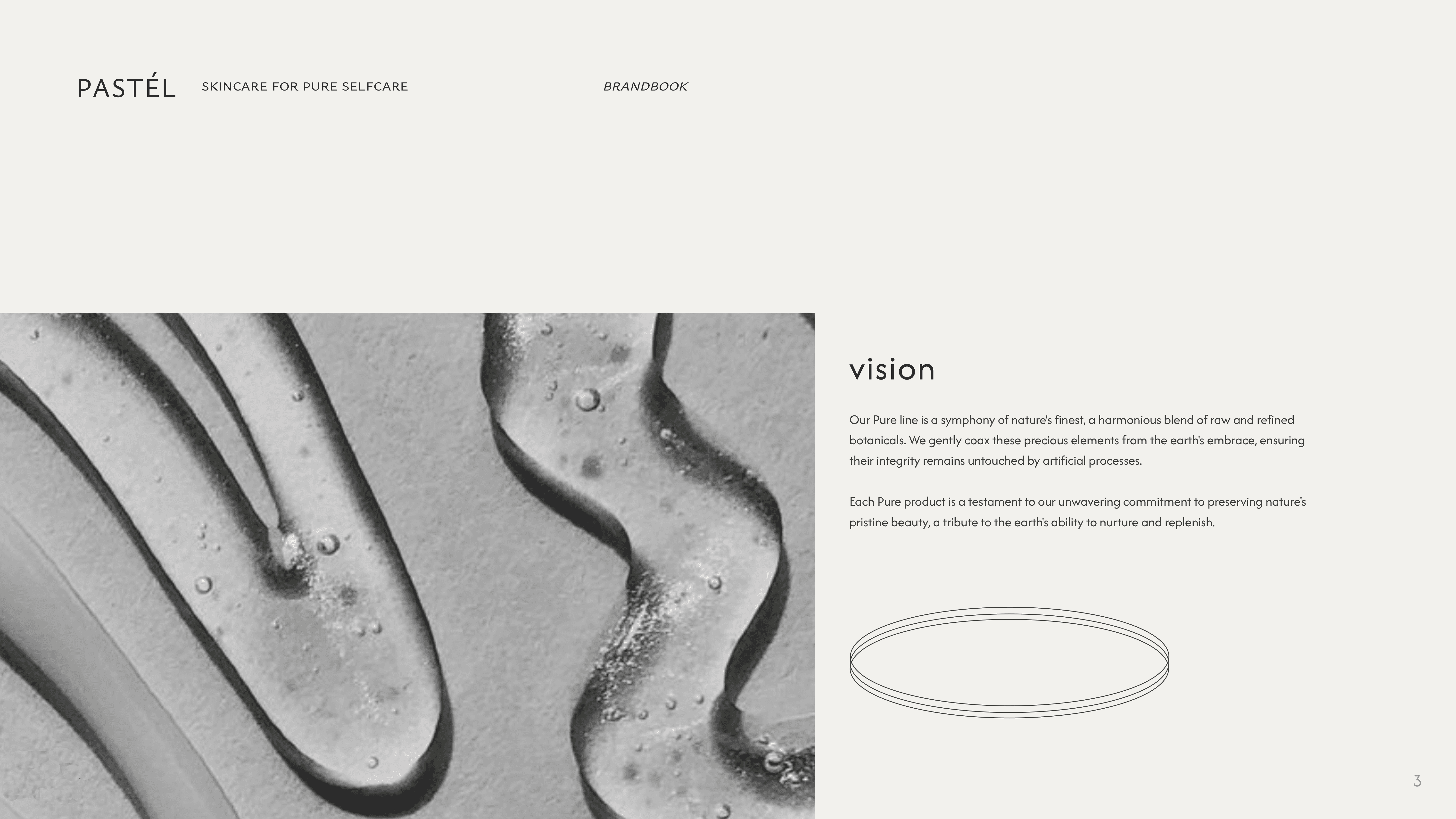
Pastel is not merely a skincare brand; it is an invitation to rediscover the beauty that lies within, a sanctuary where nature's gifts illuminate the path to radiant, healthy skin.
Process
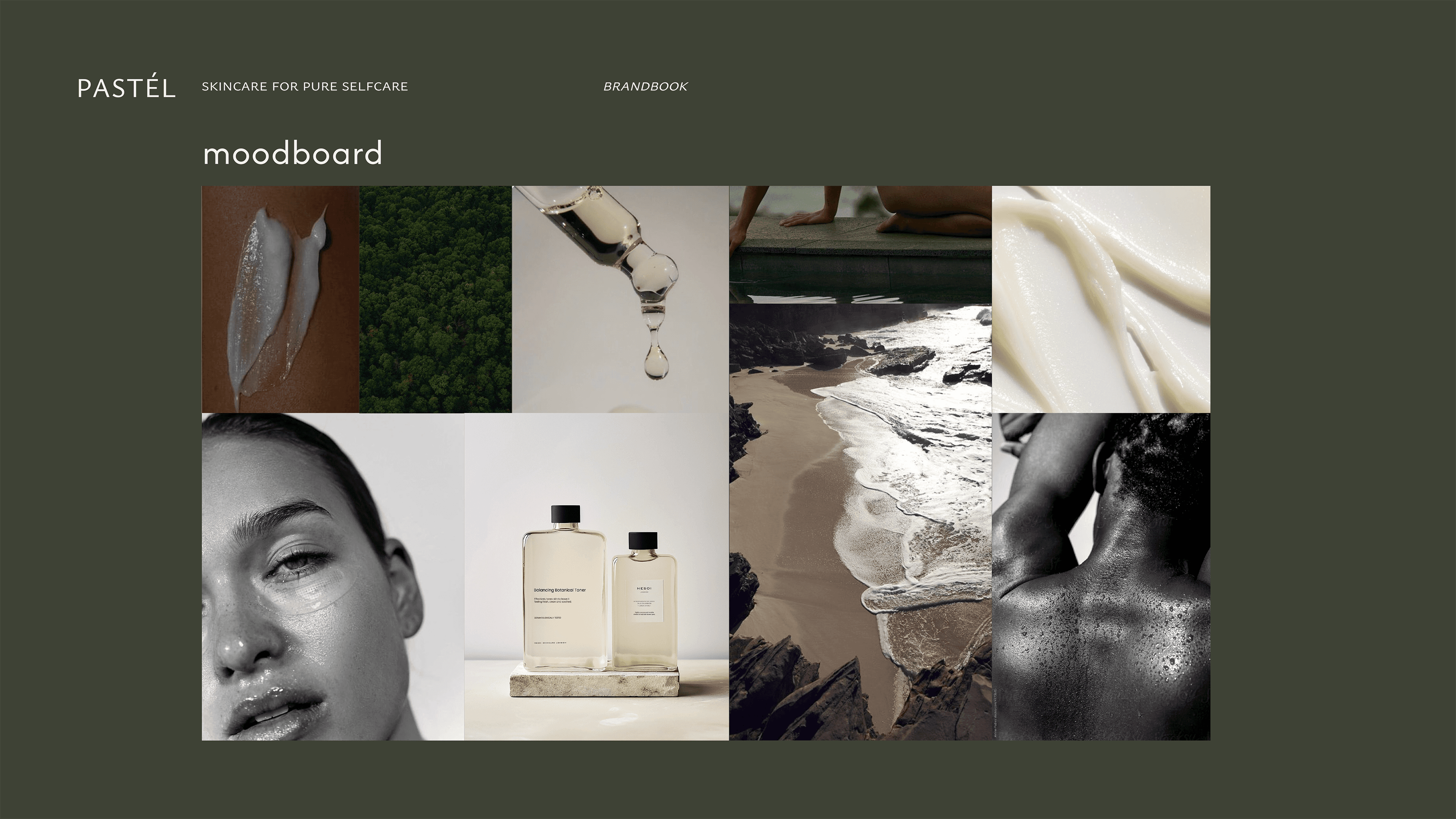
I begin by brainstorming and conceptualizing ideas for the overall look and feel.
I wanted to create a brand book anyway, so I adapted the Moodboard to my Keynote file.
To create a skincare and lifestyle brand that is not only minimalistic but also interesting to look at, I combined the visual language with appealing pictures while adding simplicity to the text.
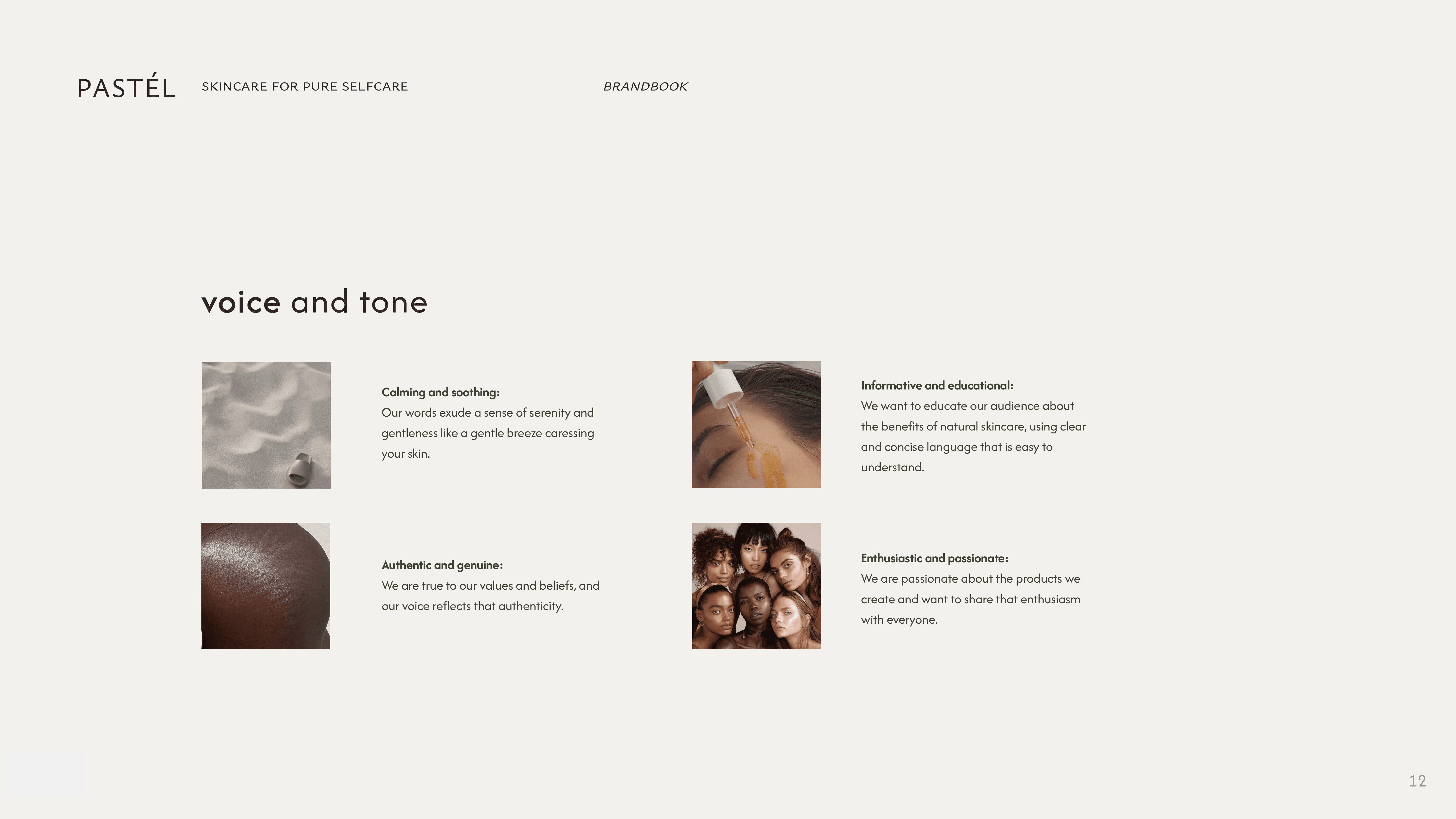
For this case, I focused on the voice and tone as this is the story behind everything and it decides if people would buy this product or not.
It should feel consistent, and authentical but not perfect.
Why? Because no skin on earth is perfect I want to normalize flaws and textured skin while also promoting that this is actual healthy skin as well.

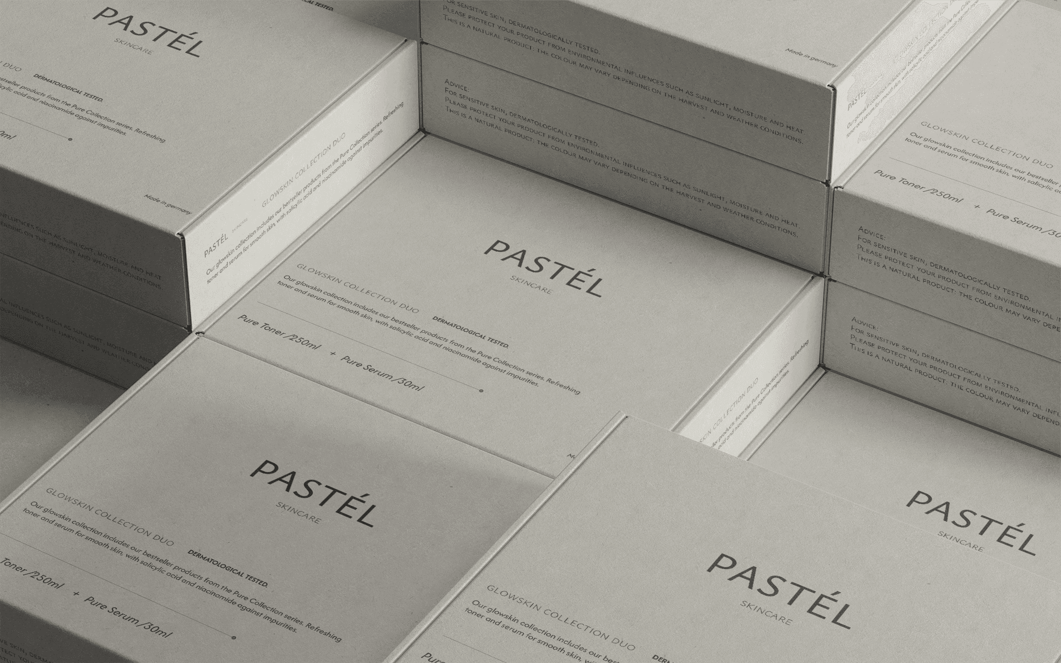
Packaging
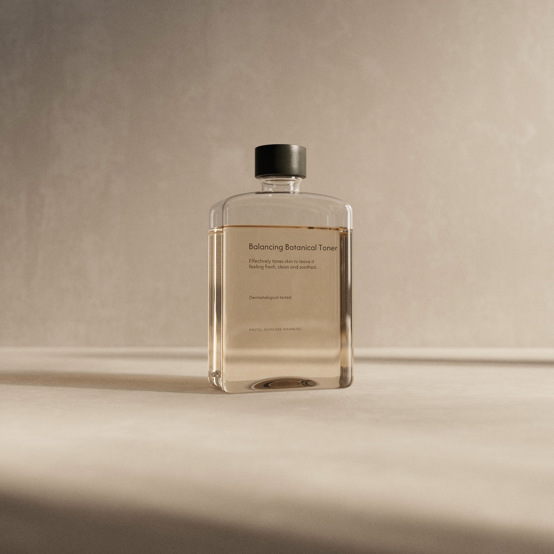
I wanted the packaging of the products to feel pure, clean, and calm. So I decided to go with a glass print for all information.

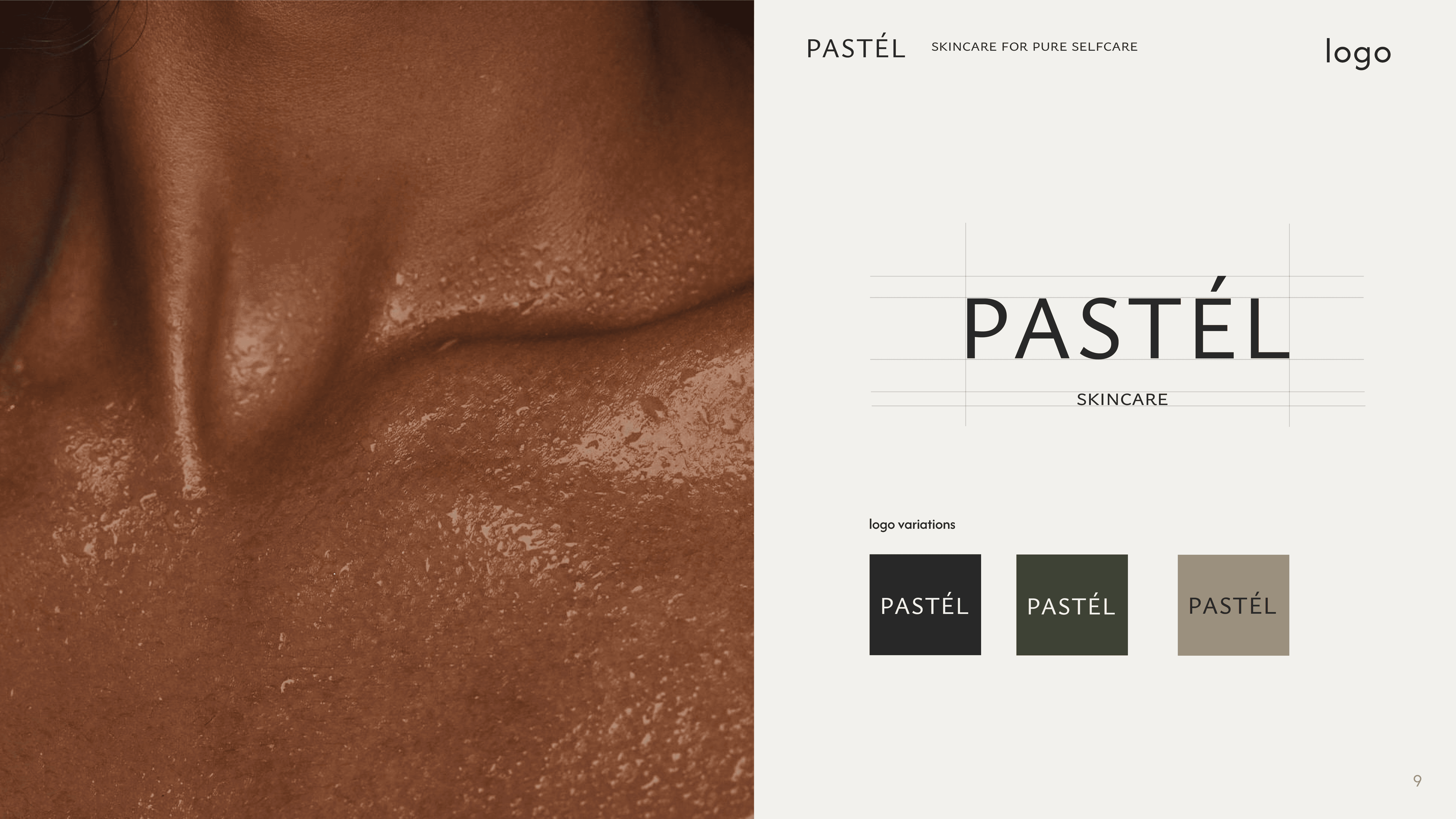
Brand Identity
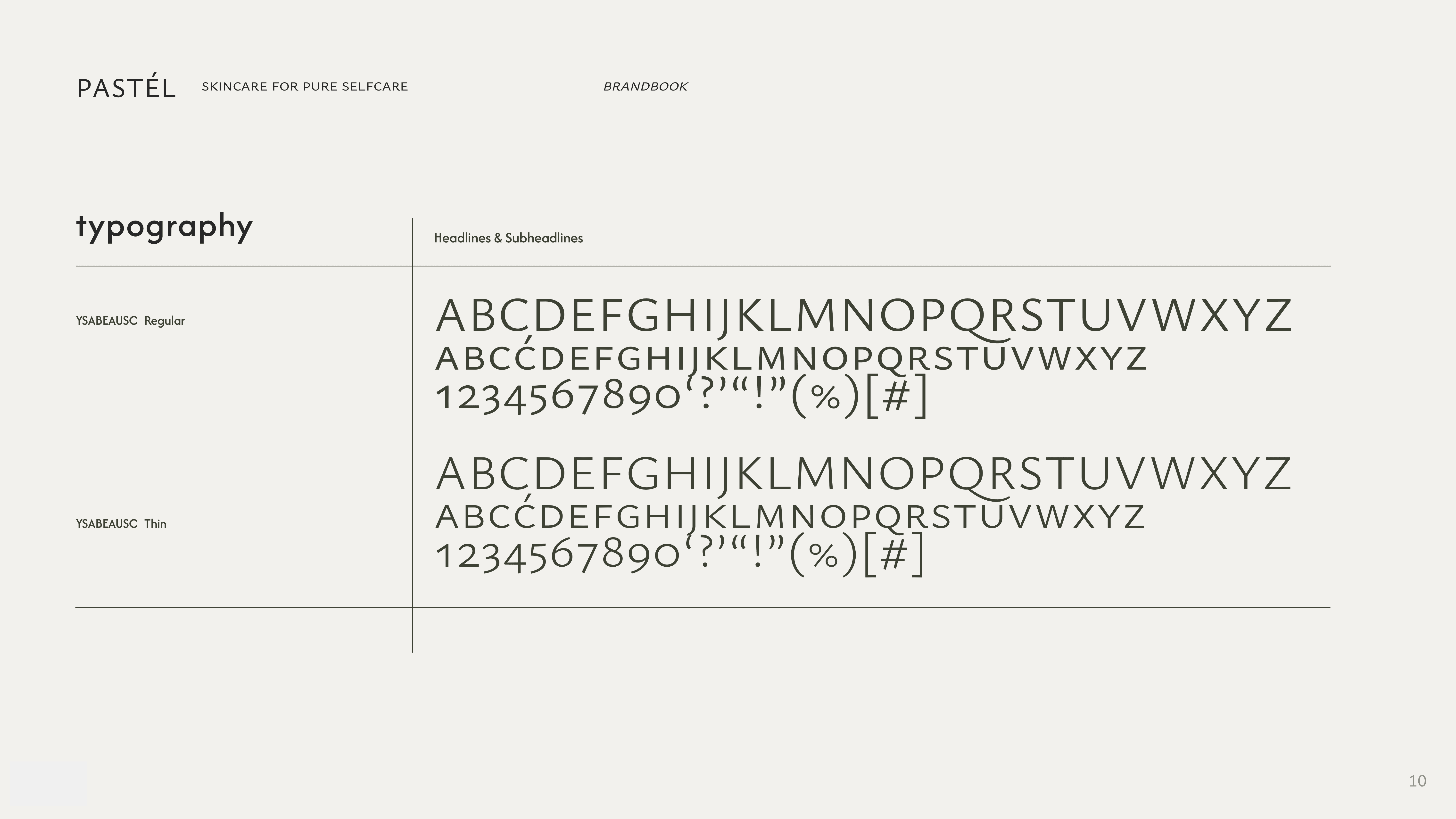
For the logo, I used "YSabeauSC Font" as Light Regular Typeface and the Subline as Light Typeface.
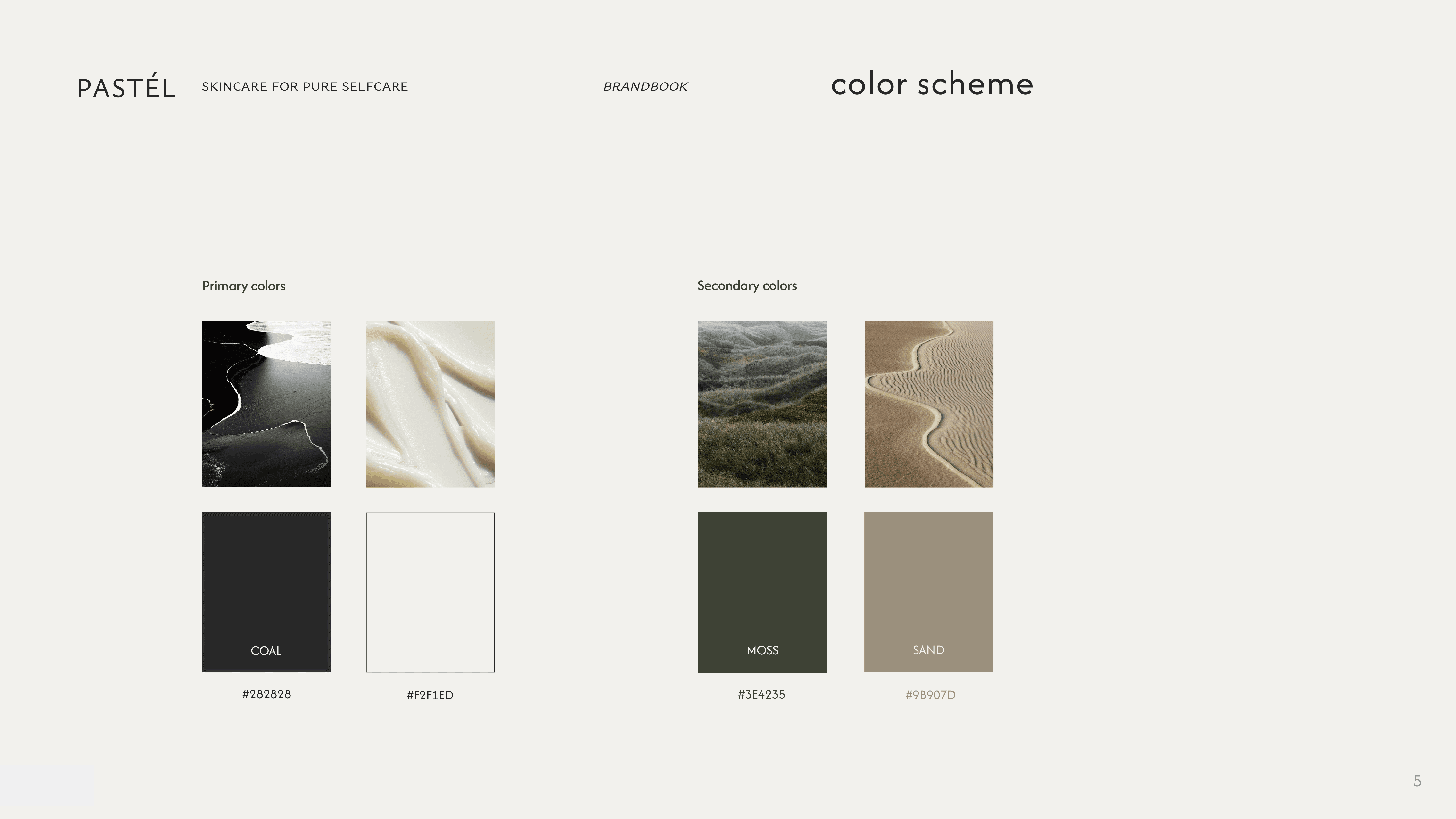
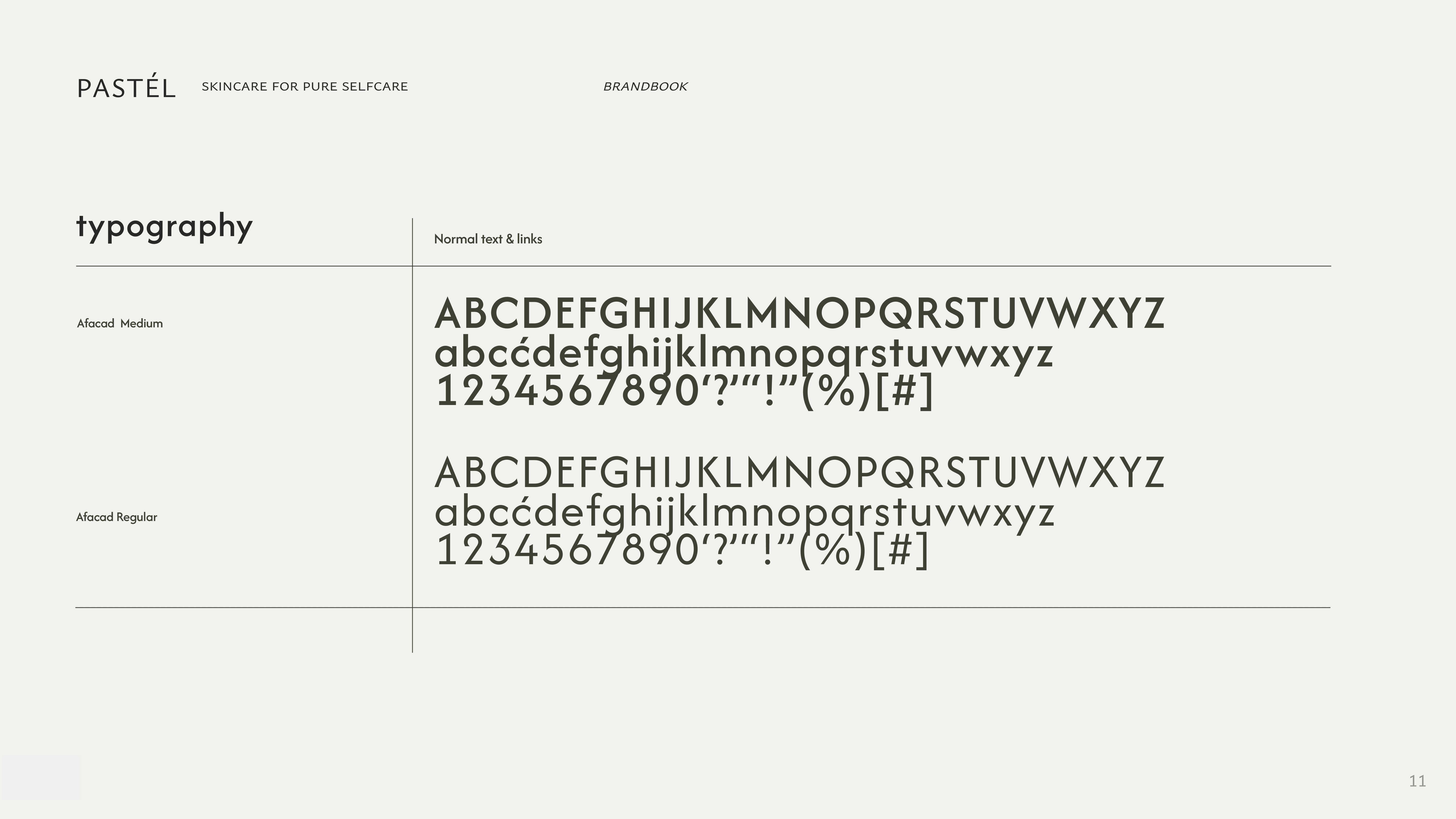
I wanted to recreate a London Fashion Brand moment to make everything feel classy. The color scheme is deeply inspired by the beautiful earth. For normal text, I went with the calm and cautious "Afasad Font" to keep the focus on the key visuals and product.
PROJECTS
Pastel skin
Everyone who knows me a little bit better, probably knows that I love skincare products, especially the organic and minimalistic ones. That's the reason why I decided to develop my own imaginary Brand "Pastel Skin".
I did the project completely on my own, from brand identity to 3D renders as well as most of the pictures are ai generated. For this project, I wanted to play with different technologies and combine them to one one concept.
Client
noncommercial
Industry
Skincare
Year
2023
Role
Brand Design & 3D
Concept
The name "Pastel skin" is derived from the softness that pastel colours convey in the environment and still trigger
a warm feeling. This is exactly what the skincare products are supposed to do.
The Brand feel Pure, Rough, Organic
and Calm.
Pastel is not merely a skincare brand; it is an invitation to rediscover the beauty that lies within, a sanctuary where nature's gifts illuminate the path to radiant, healthy skin.
Process
I begin by brainstorming and conceptualizing ideas for the overall look and feel.
I wanted to create a brand book anyway, so I adapted the Moodboard to my Keynote file.
To create a skincare and lifestyle brand that is not only minimalistic but also interesting to look at, I combined the visual language with appealing pictures while adding simplicity to the text.
For this case, I focused on the voice and tone as this is the story behind everything and it decides if people would buy this product or not.
It should feel consistent, and authentical but not perfect.
Why? Because no skin on earth is perfect I want to normalize flaws and textured skin while also promoting that this is actual healthy skin as well.
Packaging
I wanted the packaging of the products to feel pure, clean, and calm. So I decided to go with a glass print for all information.
Brand Identity
For the logo, I used "YSabeauSC Font" as Light Regular Typeface and the Subline as Light Typeface.
I wanted to recreate a London Fashion Brand moment to make everything feel classy. The color scheme is deeply inspired by the beautiful earth. For normal text, I went with the calm and cautious "Afasad Font" to keep the focus on the key visuals and product.
PROJECTS
Pastel skin
Everyone who knows me a little bit better, probably knows that I love skincare products, especially the organic and minimalistic ones. That's the reason why I decided to develop my own imaginary Brand "Pastel Skin".
I did the project completely on my own, from brand identity to 3D renders as well as some of the pictures are ai generated. For this project, I wanted to play with different technologies and combine them to one one concept.
Client
noncommercial
Industry
Skincare
Year
2023
Role
Brand Design & 3D
Concept
The name "Pastel skin" is derived from the softness that pastel colours convey in the environment and still trigger
a warm feeling. This is exactly what the skincare products are supposed to do.
The Brand feel Pure, Rough, Organic and Calm.
Pastel is not merely a skincare brand; it is an invitation to rediscover the beauty that lies within, a sanctuary where nature's gifts illuminate the path to radiant, healthy skin.
Process
I begin by brainstorming and conceptualizing ideas for the abstract renders. I searched for different scenes that catches my attention as well as started to collect references on Miro.
Once the concept is defined, I searched for similar animation sequences to get a feeling of a right movement. This helps me refine the overall structure, determine the placement of key elements, and establish a sense of balance and harmony within the artwork.
Using specialized 3D modeling software, I start constructing the virtual objects that will form the core of the composition. I create and manipulate geometric shapes, organic forms, or abstract structures. I carefully consider the overall design, proportions, and relationships between different elements to achieve the desired visual impact.
Packaging
I wanted the packaging of the products to feel pure, clean, and calm. So I decided to go with a glass print for all information.
Brand Identity
For the logo, I used "YSabeauSC Font" as Light Regular Typeface and the Subline as Light Typeface.
I wanted to recreate a London Fashion Brand moment to make everything feel classy. The color scheme is deeply inspired by the beautiful earth. For normal text, I went with the calm and cautious "Afasad Font" to keep the focus on the key visuals and product.
PROJECTS
Pastel skin
Everyone who knows me a little bit better, probably knows that I love skincare products, especially the organic and minimalistic ones. That's the reason why I decided to develop my own imaginary Brand "Pastel Skin".
I did the project completely on my own, from brand identity to 3D renders as well as some of the pictures are ai generated. For this project, I wanted to play with different technologies and combine them to one one concept.
Client
noncommercial
Industry
Skincare
Year
2023
Role
Brand Design & 3D
Concept
The name "Pastel skin" is derived from the softness that pastel colours convey in the environment and still trigger
a warm feeling. This is exactly what the skincare products are supposed to do.
The Brand feel Pure, Rough, Organic and Calm.
Pastel is not merely a skincare brand; it is an invitation to rediscover the beauty that lies within, a sanctuary where nature's gifts illuminate the path to radiant, healthy skin.
Process
I begin by brainstorming and conceptualizing ideas for the overall look and feel.
I wanted to create a brand book anyway, so I adapted the Moodboard to my Keynote file.
To create a skincare and lifestyle brand that is not only minimalistic but also interesting to look at, I combined the visual language with appealing pictures while adding simplicity to the text.
For this case, I focused on the voice and tone as this is the story behind everything and it decides if people would buy this product or not.
It should feel consistent, and authentical but not perfect.
Why? Because no skin on earth is perfect I want to normalize flaws and textured skin while also promoting that this is actual healthy skin as well.
Packaging
I wanted the packaging of the products to feel pure, clean, and calm. So I decided to go with a glass print for all information.
Brand Identity
For the logo, I used "YSabeauSC Font" as Light Regular Typeface and the Subline as Light Typeface.
I wanted to recreate a London Fashion Brand moment to make everything feel classy. The color scheme is deeply inspired by the beautiful earth. For normal text, I went with the calm and cautious "Afasad Font" to keep the focus on the key visuals and product.
Hamburg, Germany
It's currently
Send me a message if you require help
with your project, or just if you'd like to chat. hi@fenjavespermann.com